Identify bar graph vs pie charts
using AI
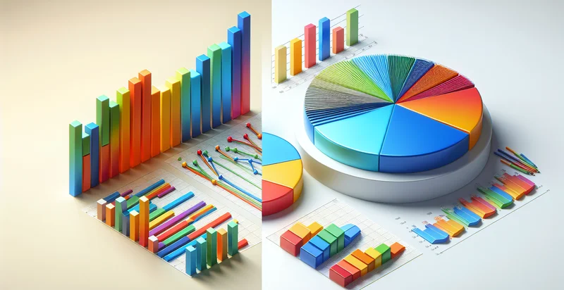
Below is a free classifier to identify bar graph vs pie charts. Just upload your image, and our AI will predict if it's a bar graph or a pie chart - in just seconds.
Contact us for API access
Or, use Nyckel to build highly-accurate custom classifiers in just minutes. No PhD required.
Get started
    import nyckel

    credentials = nyckel.Credentials("YOUR_CLIENT_ID", "YOUR_CLIENT_SECRET")
    nyckel.invoke("bar-graph-vs-pie-charts-identifier", "your_image_url", credentials)
    fetch('https://www.nyckel.com/v1/functions/bar-graph-vs-pie-charts-identifier/invoke', {
        method: 'POST',
        headers: {
            'Authorization': 'Bearer ' + 'YOUR_BEARER_TOKEN',
            'Content-Type': 'application/json',
        },
        body: JSON.stringify(
            {"data": "your_image_url"}
        )
    })
    .then(response => response.json())
    .then(data => console.log(data));
    curl -X POST \
        -H "Content-Type: application/json" \
        -H "Authorization: Bearer YOUR_BEARER_TOKEN" \
        -d '{"data": "your_image_url"}' \
        https://www.nyckel.com/v1/functions/bar-graph-vs-pie-charts-identifier/invoke
How this classifier works
To start, upload your image. Our AI tool will then predict if it's a bar graph or a pie chart.
This pretrained image model uses a Nyckel-created dataset and has 2 labels, including Bar Graph and Pie Chart.
We'll also show a confidence score (the higher the number, the more confident the AI model is around if it's a bar graph or a pie chart).
Whether you're just curious or building bar graph vs pie charts detection into your application, we hope our classifier proves helpful.
Related Classifiers


Need to identify bar graph vs pie charts at scale?
Get API or Zapier access to this classifier for free. It's perfect for:
- Data Visualization Selection: Businesses can utilize the binary classification function to automatically select the most appropriate data visualization format for presentations. By analyzing the data context, the system can determine whether a bar graph or pie chart would better convey the insights, improving communication and decision-making.
- Marketing Analytics: Marketing teams can leverage this function to assess the performance metrics of various campaigns represented in charts. By identifying whether the analysis is better suited to a bar graph or pie chart, stakeholders can gain clearer insights into campaign performance and consumer preferences.
- Reporting Automation: Organizations can integrate this identifier into their reporting tools to streamline the report generation process. Automatically selecting between bar graphs and pie charts based on data characteristics can save time and ensure consistency in visual reporting.
- E-learning Resources: Educational platforms can employ this function to help students understand the importance of choosing appropriate graph types for data representation. By providing feedback on their visual selections, learners can improve their data literacy and analytical skills.
- Research Analysis: Researchers can use the classification tool to enhance their data presentations in academic papers. Determining the better visualization type can make complex data more comprehensible to readers, thus improving the impact of their findings.
- Dashboard Optimization: Data dashboard developers can integrate this function to optimize user experience by selecting the most effective visual representation of metrics. This ensures that dashboard users receive insights quickly and intuitively, leading to more informed decision-making.
- User Interface Design: UI/UX designers can implement this classification function to enhance interactive data visualization features. By automatically suggesting the appropriate chart type based on user input or data trends, designers can create more intuitive and user-friendly interfaces for data applications.